Graphic Design

ControllerTape Games Logo
The ControllerTape logo is an understated but descriptive design: a classic and very recognizable game controller, with tape wrapped around the middle to hold it together after suffering the rage of its owner. This modern iteration of the logo takes a more minimalist approach to the original design, creating a more distinctive silhouette and preparing it for animation as a splash image.

ControllerTape Jersey Logo
Inspired by baseball jerseys, this take on the original ControllerTape logo blends flashy, distinctive text with the logo and adds a subtle 3D tilt to give it a sense of floating in whatever field it’s set in. This take on the logo is a whimsical one, intended for use on merchandise in particular.

Birdcorps Concert Poster Mockup
Graphic styles naturally attach themselves to other cultural phenomenon. Art deco immediately brings to mind the Roaring 20’s. graffiti stylings are intrinsically tied to rap culture. Here, the grunge look sells this fictional group as a late-90s, early-2000s indie rock band with its chaotic, unrefined strokes and broken lines.

Guardians of the Scar Game Logo Mockup
Sometimes, a logo is intended to be heavily illustrative in nature, becoming more than well-formatted text or a market-friendly image. This is especially true for comics, movies, and in this mockup, a video game title. Once drawn, a logo like this can be converted to vector or, since my illustrations are very high-res to begin with, used as-is.

Giga Dentist Title Logo
Big and bombastic, ControllerTape’s Giga Dentist game project drills (tee hee) a theme into the viewer’s head, with bright colors and a pair of sharp, contrasting 3D inclines that give the piece a dynamic impact worthy of the game. This is a solid example of using graphics to fill out and balance otherwise tricky and uneven typography.

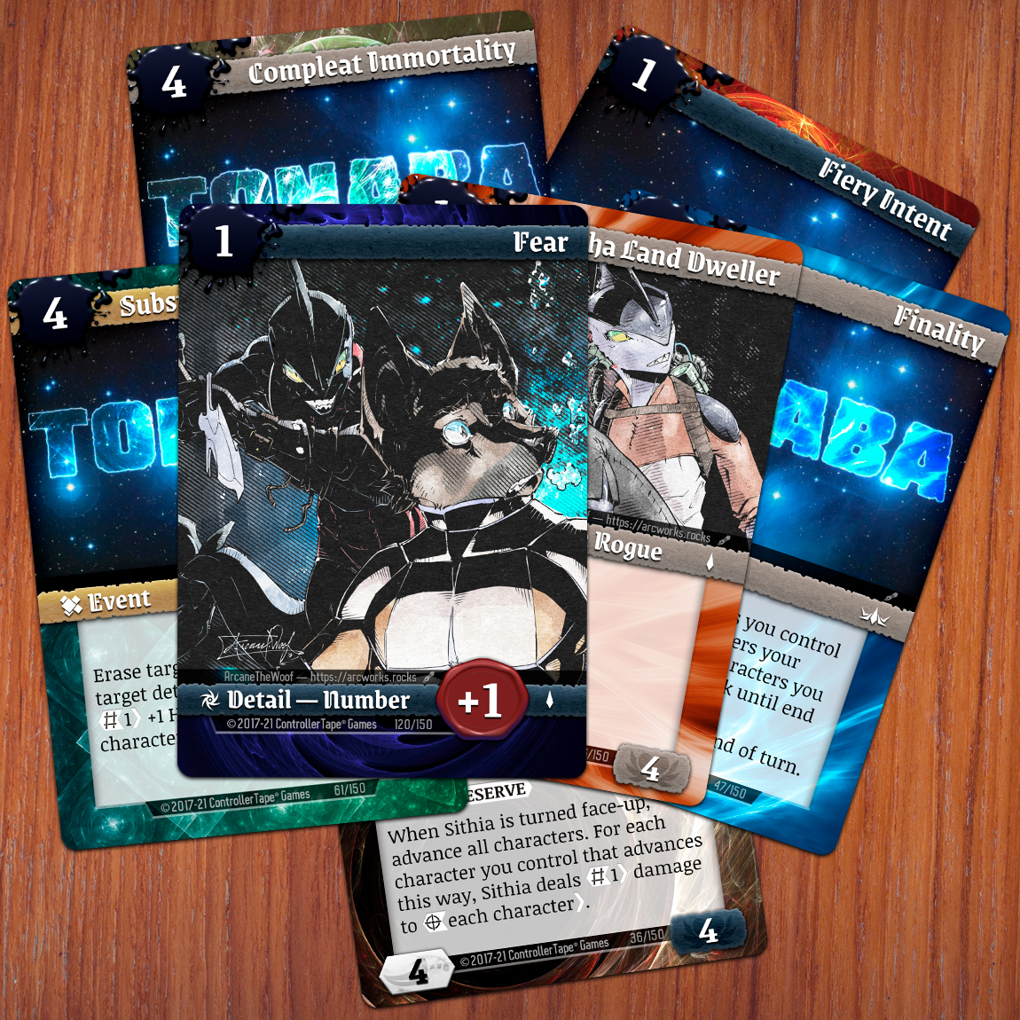
Tonaba Card Game
With Tonaba—a card game in development—I needed to ensure that it would stand out against other games in its genre; I followed a motif of using fractal art that captures the essence of each card’s “element”, and provides variety within a distinctive theme. In addition, I opted to use several different colors and silhouettes for the card structure to give additional flavor to each card, enabling them to convey a good-vs-evil theme.

Warbunnies Sports Logo Mockup
I have a thing for sports designs, especially with modern style and logos. This design was borne of the idea that it would be particularly demoralizing to be defeated by the “Warbunnies”, and features large, distinctive shapes and bold colors that naturally lend themselves to field uniforms, recognizable even from a distance. I’m particularly fond of the cap mockups. I love a good field cap, and these would be a delight to wear.

D&D Adventure: Bloodstained Temple Page
Graphic Design extends to typography and layout, especially in heavily stylized documents like this page from a Dungeons & Dragons campaign I’ve been working on. A thorough familiarity with fonts, blocking, and readability allows for interesting and attractive documents that go beyond conveying information, infusing each page with an artistic flair and professionalism.
It’s important with document layout not to go overboard with artistic elements; design work of this nature should be content-forward, ensuring that the design complements the work, rather than distract from it.